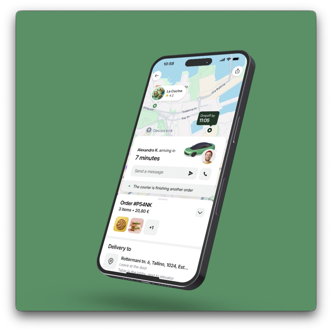
The order is placed. The uncertainty begins.
After checkout, the user’s question changes. First: has the restaurant accepted my order? Then: when will it arrive? Finally: where is the courier, and how do we find each other?
Bolt Food’s active order screen gave all of these moments the same map-led layout. During preparation, the map had little to say. A detailed timeline exposed operational changes without always helping users understand what they meant. As the courier approached, the information and actions that mattered needed to become more prominent.
The design challenge: show enough to build trust, without asking people to interpret every step of the delivery operation.
My role
As Product Design Manager for Delivery Consumer, I built the case for investment, helped secure budget, led the design team, and aligned product, engineering, analytics, brand, and senior stakeholders.
The team
I worked with product, design, engineering, analytics, and content design, alongside the wider brand and product teams.
Making the work possible
The broader redesign was outside the funded 2025 strategy. Getting it moving meant connecting the experience problems to a business opportunity, then turning the vision into a scoped proposal that leadership could assess.
A time window while cooking. A countdown on the way.
Preparation carries more uncertainty than the final journey to the customer. A precise arrival time can feel like a promise, even when cooking and courier assignment are still changing. Every adjustment then reads as another delay.
The communication strategy used an arrival range during preparation and relative time during delivery. The range gives people a window to plan around; a countdown becomes useful when the courier is actually on the way.
Communicate a realistic window while preparation and dispatch are still variable.
Switch to a relative estimate when the user needs to get ready for the handover.
Reduce notifications about intermediate courier steps and simplify the status story.
The earlier communication work informed the redesign’s approach to ETA and status presentation.
Nine milestones to make the vision real.
The earlier communication work gave us a starting point. In late 2023 and early 2024, I benchmarked ETA formats and order-status patterns across delivery apps, then proposed a hybrid ETA model. That research helped frame the next question: what should the whole waiting experience become?
For the broader redesign, we followed a process that moved from hands-on research to concepts, investment decisions, and implementation. The work overlapped: findings changed the concepts, engineering estimates changed the MVP, and reviews exposed gaps that static screens had missed.
Remote research
I planned hands-on research with the design team to document our own experience and competitors through real orders. When the Warsaw research trip was blocked, I adapted the plan to remote orders and recordings, with additional help in India and Indonesia. This gave us core flows and high-level patterns, with less depth than an on-site study.
Output: Recorded journeys and comparative observations to inform the redesign.
Ideation
I translated the opportunity into low-fidelity flows and wireframes, ready for review on September 4. We focused first on the early order phase: getting its layout right would create the foundation for the later states. Moodboards and early concepts gave the team material to challenge and develop.
Output: Initial layouts, flow options, and wireframes.
Evaluation & prioritisation
Product prioritised the opportunity areas while analytics added supporting evidence and impact estimates. I worked with analytics to structure the business case around trust and retention, support costs, monetisation, cross-sell, and courier efficiency. This made the investment discussion specific enough to compare with other priorities.
Output: A prioritised opportunity set and an evidence-backed business case.
Design workshop
I organised the design workshop around the early wireframes so the team could refine ideas, explore variations, and align on a direction. This was a working stage: the layouts were deliberately unfinished, leaving room to change the structure before committing to detailed design.
Output: Refined concepts and a shared direction for the next fidelity pass.
Concept finalisation
We developed the strongest ideas into more detailed flows and a prototype. The October 10 review challenged the route presentation, payment-processing actions, cancellation help, upsell placements, and the hierarchy of dishes and options. I incorporated additional modular scenarios, including recommendations after a rejected order and discovery for future orders.
By November 12, the vision and core structure were agreed. Simplifying status transparency remained a hypothesis to validate, rather than an assumption everyone had accepted.
Output: A reviewed concept, prototype, and explicit questions for validation.
Decomposition into milestones
Product translated the vision into delivery milestones. I partnered on the MVP scope and mapped the order stages and detailed design tasks, with input from content design. Engineering estimates made the cost of animation and interaction details visible, so scope decisions could happen before implementation.
Output: An MVP state map, task breakdown, and phased delivery proposal.
Presentation preparation
I prepared the vision deck and prototype walkthrough for the December leadership review. The presentation connected the experience to the opportunity and the proposed delivery path. In parallel, I shared animation-format samples with engineering so we could investigate how the motion would work in the app.
Output: A vision presentation, prototype walkthrough, and motion samples.
Management reviews
I pushed for a dedicated leadership review once the proposal had scope and estimates. The process plan records the direction and delivery path as confirmed. The follow-up established engineering ownership and reaffirmed the MVP focus. Alongside this, I brought Food, Rides, and Rentals designs together to align their foundations.
Output: An agreed direction and delivery path, with clear engineering ownership.
MVP implementation
The work continued through engineering handover, content clarification, design reviews, and QA. We resolved questions such as distinguishing courier pickup from self-pickup, preserving address details, showing the right ETA format, and handling map markers and transitions. I reviewed the implementation with the team and kept design decisions connected to the screen architecture.
The March 9 review produced a concrete polish list. QA sign-off followed on April 13, with remaining issues recorded for triage and later builds.
Output: An implemented MVP ready for controlled customer validation.
Each milestone made a different decision possible: what to explore, what was worth funding, what to build first, and what still needed testing.
The nine stages come from the original project process plan. Dates reflect the supporting project discussions; stages overlapped. The plan’s time estimates are not presented as measured delivery durations.
Let the order stage decide what comes first.
The redesign built on a simple principle: status matters most during preparation; location matters most during delivery. These are two states of the same screen, with transitions that preserve the user’s context.
- Clear current status and arrival window
- 3D illustration replaces the default map
- Order summary collapsed by default
- Map available when requested
- Courier movement takes priority
- ETA and courier identity stay together
- Call and message actions on the card
- Handover details available in context
Details when needed. A structure that can grow.
Below the primary surface, a modular feed holds the order summary, delivery address, merchant information, and help. Modules can expand, collapse, or change priority with the order state. The default stays simple, while details remain available.
This architecture also creates room for future capabilities without rebuilding the screen. The first milestone focused on the foundation and existing functionality. Address editing, basket additions, and more advanced self-service were separate follow-up work.
Make the handover easy to understand.
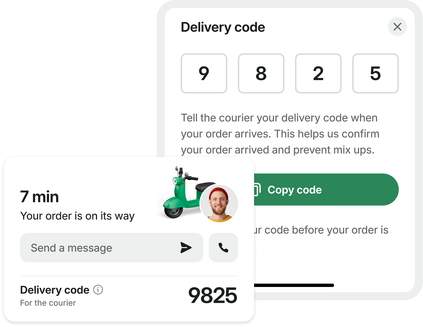
During delivery, the courier card brings the arrival estimate, courier identity, and contact controls into one place. When a delivery code is required, it sits with that same information, with an explanation of when to share it.
A familiar pattern across Bolt.
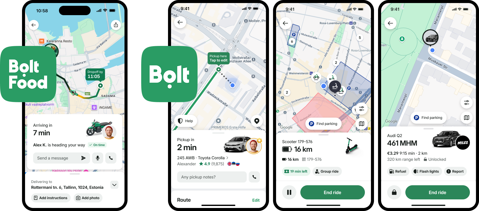
I brought the current screens, work in progress, and future directions across Food, Rides, scooters, and car sharing into one comparison. The aim was to align on the fundamentals while allowing for different service needs and delivery schedules. A shared hierarchy connects the map, the main status card, and the actions beneath it.
A first release that unlocks the next ones.
The design process produced a broader vision than the first release could contain. The initial product roadmap divided delivery into three milestones, with the core architecture first and more complex capabilities following it.
Establish preparation and delivery states, simplified status, new visual assets, courier information, and help. Keep existing functionality working. New address-editing and basket-addition capabilities were excluded from this release. This is the milestone evaluated in the 2026 experiment.
The next proposed phase included contextual promotions and upsell, address editing, proactive delay communication, and smarter cancellation options. These were separate capabilities with their own dependencies and scope decisions.
The longer-term vision included a dynamic feed, partner themes, support for grouped or bundled orders, and more advanced self-service such as basket editing and switching delivery to pickup.
Milestones 2 and 3 describe the initial roadmap, rather than a claim that every proposed feature subsequently shipped.
Validation after implementation
Before customer exposure, the team worked through feature testing, design QA, and employee-release preparation. The next decision was to use a controlled experiment to check for harm before scaling the redesign. That made ordering behaviour, support contacts, cancellations, and courier drop-off part of the design feedback loop.
Controlled validation
The team used a controlled A/B experiment to evaluate the redesigned experience before wider rollout. The measurement plan considered ordering behaviour, support contacts, cancellations, and courier drop-off alongside design and usability checks.
Validation continued beyond the prototype: feature testing, employee feedback, design QA, and issue triage helped connect the intended experience to its implementation.
Clarity is about timing as much as information.
My role connected the case for investment with the design direction and the team delivering it. The work moved from individual ETA and status improvements toward a screen architecture that responds to the user’s situation. A preparation screen should help someone wait; a delivery screen should help them receive their order.
Visual quality was one part of the design brief. The validation approach also considered how clearer information and easier actions could affect customer decisions and courier workflows.