All work
UX Case Study · Campaigns · 2022–2025

Discount
Communication

Three years of evolving how Bolt Food communicates discounts — from a cognitive-overload problem to a scalable system covering capped offers, payment incentives, Bolt Plus, and stacked campaigns.

Campaigns UX Systems Design A/B Testing Checkout ✦ 2022–2025
01   The Problem

150+ campaign combinations. One broken experience.

By 2022, Bolt Food's discount system had grown into something users consistently found confusing and overwhelming. Every surface — home screen, provider page, menu, basket, checkout — was showing its own version of discount information, often using different visual languages, icons, colour codes, and copy patterns.

The core issue wasn't any single screen. It was the absence of a strategy. Discounts had been added reactively, each campaign type bolted on independently, until the system collapsed under its own complexity.

"The amount of available discount information is overwhelming and distracting — a massive cognitive overload that makes it hard to digest and creates an inability to focus."

Three documented problems

Chapter 01
Foundation — A Strategy for Discount Communication
2022–2023
02   Strategy

Explicitness by journey stage

The first design decision was the most important: not all discount information needs to be visible at all times. The right level of detail depends on where the user is in their journey. Showing everything everywhere was the root cause of the overload — so the strategy was built around a staged explicitness model.

Exploration
Home · Search
Indicate the best deal, hint at conditions

At this stage users are scanning, not deciding. Show one discount badge per provider — the most attractive one. Use visual differentiation to signal conditional vs. unconditional, without showing conditions upfront. Menu discounts take priority over delivery discounts in the visual hierarchy.

Consideration
Provider · Menu
Expand detail on request — scalable banner system

Users are now evaluating a specific provider. Introduce mini campaign banners in a horizontal slider — each banner shows the campaign type and conditions. Detailed information available on tap. The slider format scales to any number of campaigns without pushing content below the fold.

Purchase
Basket · Checkout
Full transparency — all discounts visible, clearly calculated

At basket level, users need to see exactly what they're saving and why. Show all applied discounts in a single "Discount" line. A basket size progress bar motivates users to reach campaign thresholds before they've committed. Maximum clarity before payment.

Visual hierarchy — what shows first

Menu discounts were placed at the top of the priority stack. An unconditional 20% off the menu is more valuable and more understandable than a conditional free delivery. The hierarchy was formalised and implemented consistently across home, search, and groceries surfaces:

Chapter 02
A/B Tests — Finding the Right Approach
2022–2023
03   A/B Tests

Testing three variants across surge, delivery, and basket communication

The strategy was validated through a structured programme of A/B tests — three primary experiments testing how and when to show discount and surge information, and how to communicate conditional campaigns without hurting conversion.

Test 1 — Surge communication

Surge indicators were applied to most providers simultaneously, creating noise rather than signal. Three variants were tested against the baseline:

VariantApproachResult
A — BaselineSurge shown alongside discount on every provider cardConfusion, overload — users unclear on final price
B — Suppressed surgeSurge hidden when any discount (conditional or not) is applied; grayscale surge icon only when no discount+2% improvement in home→provider conversion
C — Snackbar onlySurge communicated only via a dismissible snackbar on home screen; not shown on individual cardsNeutral — users missed surge context at basket level
D — Snackbar + suppressedCombined approach: surge suppressed on cards when discount active; snackbar as additional contextBest clarity score in usability testing; shipped as default

Test 2 — Conditional delivery discount display

The main question: show the conditional price upfront, or protect conversion by revealing conditions progressively?

VariantApproachResult
AShow conditional delivery fee as a range (e.g. "€0–1.99"); condition detail on tap+3.1% provider open rate vs. baseline
BRange price + visible basket progress bar on provider page+3.1% open rate + higher basket sizes; shipped
CMini banner with campaign info; no price shown upfront−1.8% open rate — too much friction before commitment

Test 3 — Basket progress bar visibility

Previously the "spend more to unlock discount" progress bar only appeared after the first item was added. Testing earlier visibility:

VariantApproachResult
ControlProgress bar appears after first item addedBaseline
TreatmentProgress bar visible before any item added, then persists on scroll (mini banner hides, bar stays)+4.2% average basket size; +2.8% campaign redemption rate
Chapter 03
Capped Discounts
2023
04   Capped Discounts

When "up to X" needs to be honest

Capped discounts — campaigns where the maximum saving is limited (e.g. "15% off, up to €5") — introduced a new communication challenge. The original system had no way to distinguish a capped campaign from an uncapped one. Users who expected to save a large amount were seeing smaller discounts applied at checkout, with no upfront explanation.

Before
  • Badge shows "15% off" — no cap visible
  • User adds large basket expecting full 15%
  • Checkout shows lower discount — trust broken
  • Support tickets about "missing discount"
  • No cap indication anywhere in the flow
After
  • Badge: "15% off, up to €5" — cap shown at first touch
  • Mini banner on provider page clarifies cap condition
  • Progress bar shows "cap reached" state when threshold hit
  • Checkout discount line shows exact cap amount clearly
  • Success state animation when cap is achieved

The cap-reached state

Once a user's basket hit the cap threshold, the progress bar needed a clear "you've got the maximum" state. This was the first introduction of a multi-stage progress bar: the bar fills through different thresholds sequentially, with a 2-second celebration animation at each milestone and a permanent "achieved" state at the final threshold.

−18%
discount-related support tickets
+5.5%
campaign redemption rate
+3.2%
checkout conversion
Chapter 04
Payment Method Discounts
2023
05   Payment Methods

Surfacing discounts that depend on how you pay

Payment method campaigns — discounts unlocked by paying with a specific card, bank, or wallet — were among the hardest to communicate because the discount is conditional on an action users take at the very end of the checkout flow. If they don't know the discount exists before they've built their basket, they may never use the qualifying payment method.

The design challenge was where to surface this: too early and it's irrelevant, too late and it's too pressured. The solution was a new checkout section — a payment method suggestion block that appeared in the basket only when a qualifying method was available for the current basket value, positioned above the payment selector.

Discovery
Mini banner on provider page

Payment method discount appears in the campaign banner slider alongside other offers. Low explicitness — just enough to build awareness before the user has committed to a basket.

Basket
Contextual suggestion block

A dedicated block appears in the basket showing the qualifying payment method and the saving it would unlock for the current basket total. Personalised — only shown if the user has a qualifying card saved. Dismissed once payment method is changed to the qualifying one.

Checkout
Applied discount shown in receipt section

Once the qualifying method is selected, the discount appears in the standard discount line. No additional UI needed — the existing discount communication handles it.

A/B test — basket position

VariantPlacementResult
A — Top of basketPayment suggestion above item list−2.1% conversion — too prominent, felt like an ad
B — Above payment selectorSuggestion block immediately above payment method row+6.4% adoption of qualifying payment method
C — Inline with payment rowSmall badge next to qualifying payment method option+4.8% adoption — cleaner but less visible at lower basket values

Variant B shipped as default. The contextual timing — showing the suggestion precisely where the user is about to make a payment decision — outperformed both earlier and more subtle placements.

Chapter 05
Bolt Plus Discounts
2024
06   Bolt Plus Integration

Showing Plus discounts without disrupting the menu

When Bolt Plus menu discounts launched, the existing discount communication system couldn't handle a new type of campaign that was applied conditionally — only for subscribers — and needed to be visible at item level across the entire menu simultaneously. Showing green strikethrough prices on every item with a Bolt Plus discount created a visual overwhelm that conflicted directly with the cognitive load reduction work done in 2022.

The design brief: make Bolt Plus discounts clearly visible and motivating for subscribers, without creating noise for non-subscribers. The solution separated the communication by subscription state.

Non-subscriber
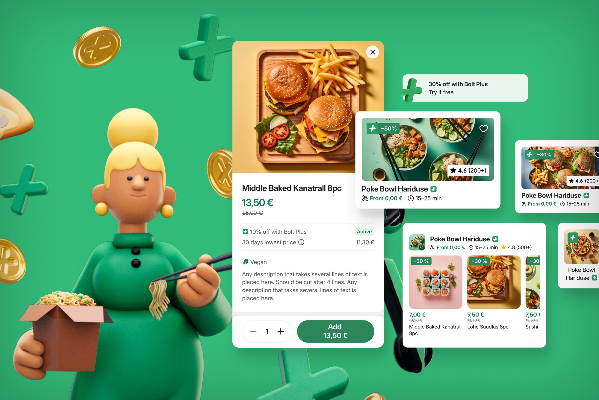
  • Bolt Plus badge on provider card on home screen
  • Mini banner on provider page: "X% off with Bolt Plus"
  • Item prices shown at regular price
  • No item-level indication — avoids confusion and envy
  • CTA to subscribe in banner — single conversion path
Subscriber
  • Green item prices throughout the menu
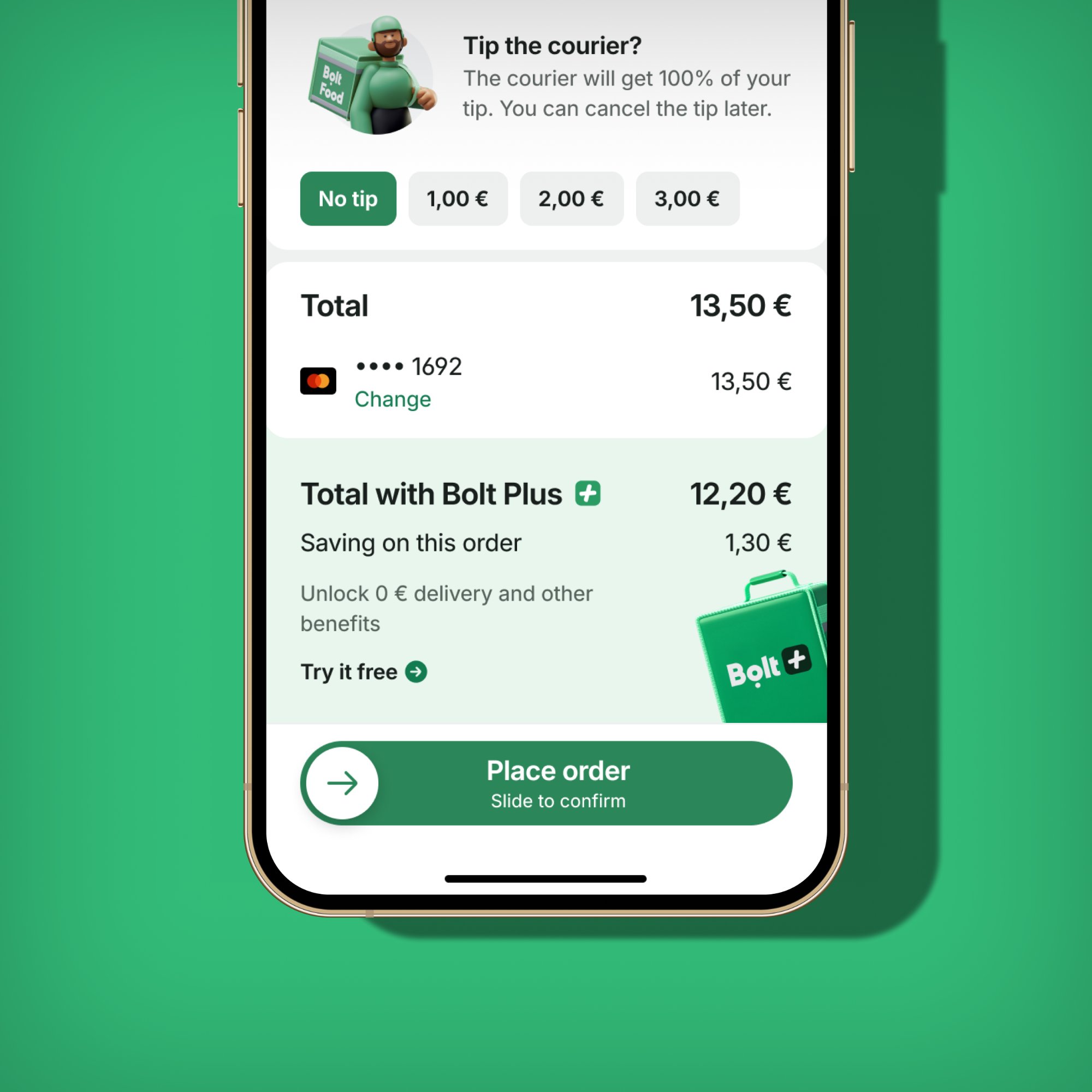
  • Savings shown at item, basket, and checkout level
  • Total savings summary in checkout receipt
  • No campaign banner needed — pricing itself is the communication
  • Order history shows Plus savings per order
Bolt Plus checkout upsell showing discount applied
Checkout — Plus saving shown in receipt section
Bolt Plus menu discount overview
Menu discount composite — subscriber view

A/B tests — Plus visibility at checkout

VariantApproachResult
A — Savings onlySingle "Bolt Plus saving: −€X" line in receipt+9.2% subscriber satisfaction score
B — Savings + totalSaving shown alongside updated total dynamically+12.4% subscriber re-order rate (shipped)
C — Mini bannerMini banner at top of basket reminding subscriber of saving−3.1% conversion — banner fatigue

For non-subscribers, a separate upsell test at the checkout level was run (covered in the Bolt Plus Subscription case study), which produced a +13.1% subscription conversion lift. The key insight from the Plus discount communication work: for subscribers, the discount must be felt through price, not messaging.

Chapter 06
Stacked Discounts
2024–2025
07   Stacked Discounts

When multiple campaigns apply — making it legible

Stacked discounts — multiple campaign types applying simultaneously to a single order — were the most technically and visually complex challenge in the campaign communication work. A user might simultaneously have a menu discount, a delivery discount, a Bolt Plus saving, and a payment method discount all active at once. Each had been designed independently, with no framework for co-existence.

The stacked discounts work, which required 8 man-weeks of design effort alone, rebuilt the checkout receipt section from first principles to handle any combination of discount types without ambiguity.

The stacking problem

The solution — a unified discount receipt architecture

The checkout receipt was redesigned to show a structured savings breakdown. Instead of multiple independent lines, all discounts are grouped under a single expandable "Discounts" section with individual lines per campaign type inside. The collapsed state shows the total saving; expanded shows the breakdown. This worked regardless of how many campaigns were active.

Home / Search
One badge — the highest-value discount

When multiple campaigns are active, only the most attractive one is shown on the provider card. A small "+" indicator signals that additional offers exist, without creating visual noise.

Provider / Menu
Banner slider shows all active campaigns

All stacked campaigns are represented as individual banners in the horizontal slider. The order follows the visual hierarchy: menu discount first, then delivery, then Plus, then payment method. Users can swipe to see all.

Basket / Checkout
Expandable discount breakdown

All applied discounts are visible in a structured receipt section. Each line is labelled by type. The total is prominently shown. Users can expand for detail. This pattern handles 1 to N campaigns with no layout changes required.

A/B tests — stacked discount display at checkout

VariantApproachResult
A — Single line"Discount: −€X.XX" (aggregated, no breakdown)Baseline — clean but opaque
B — Expanded breakdownAll discounts listed individually by type, always expanded−4.3% completion rate — too much information at payment step
C — Collapsed + expandTotal shown, expandable to breakdown on tap+7.8% user trust score in usability testing; +1.9% repeat order rate (shipped)

"Stacked discounts required 8 man-weeks of design, while Bolt Plus menu discounts took 6 — the complexity of our campaign system was becoming its own tax on every new feature."

Chapter 07
The Problem That Remains
2025 →
08   What's Next

150+ combinations — the system needs a reset

Three years of iterative improvements resolved the worst of the original problems, but the underlying complexity remained. By 2025, the audit showed 150+ distinct campaign combination types, each maintained separately. Each new campaign type still required weeks of design work. The premium feel of the experience was consistently being traded off against the need to surface one more type of offer.

The 2025 "Campaigns Communication — Problems and Opportunities" initiative — also written by this team — set out to address this at a higher level: not just how discounts are communicated, but whether the system that generates them can be simplified enough to allow a genuinely premium design.

Current state
  • 150+ campaign combinations, each maintained separately
  • New campaign types require 6–8 weeks of design work
  • Inconsistent visual language across surfaces
  • No clear distinction between Bolt Plus, cashback, promotions
  • Quality consistently deprioritised against business needs
Direction
  • Unified campaign architecture across all surfaces
  • Single visual language for all discount types
  • Scalable layout system requiring no per-campaign design work
  • Rebuilt checkout that handles any combination simply
  • Premium, trust-first experience at every touchpoint
09   Reflections

What three years of discount design teaches you

What worked

  • The explicitness-by-journey-stage model held up across every subsequent feature addition — it was the right mental model from the start
  • A/B testing conditional campaign display upfront vs. progressively revealed that users respond better to honesty than to withheld information
  • The mini banner slider pattern scaled to payment method, Plus, capped, and stacked campaigns without requiring structural changes
  • Separating non-subscriber and subscriber states for Bolt Plus prevented the confusion that plagued earlier multi-type discount display

Harder than expected

  • Each new campaign type required its own edge cases — capped discounts, legal restrictions on alcohol, payment method eligibility all added significant design complexity
  • The cost of not having a unified system only became fully visible after 2–3 years — earlier investment in architecture would have saved significant engineering and design time
  • User trust, once broken by a confusing discount experience, is very slow to rebuild — qualitative signals (support tickets, NPS comments) lagged improvements by months
More case studies
← Back to all work