All work
UX Case Study · Subscription · Food Delivery

Bolt Plus
Subscription Experience

Making a subscription feel earned — from the first hero banner impression through checkout savings to every order after sign-up.

Product Design Subscription UX Multi-surface A/B Tested ✦ Shipped 2025
01   Overview

A subscription program that needed to be felt, not just noticed

Bolt Plus is a food delivery subscription offering free delivery, menu discounts, and service fee waivers. The product worked — but users couldn't see or feel the value clearly enough to subscribe, and subscribers couldn't see it reinforced throughout their experience.

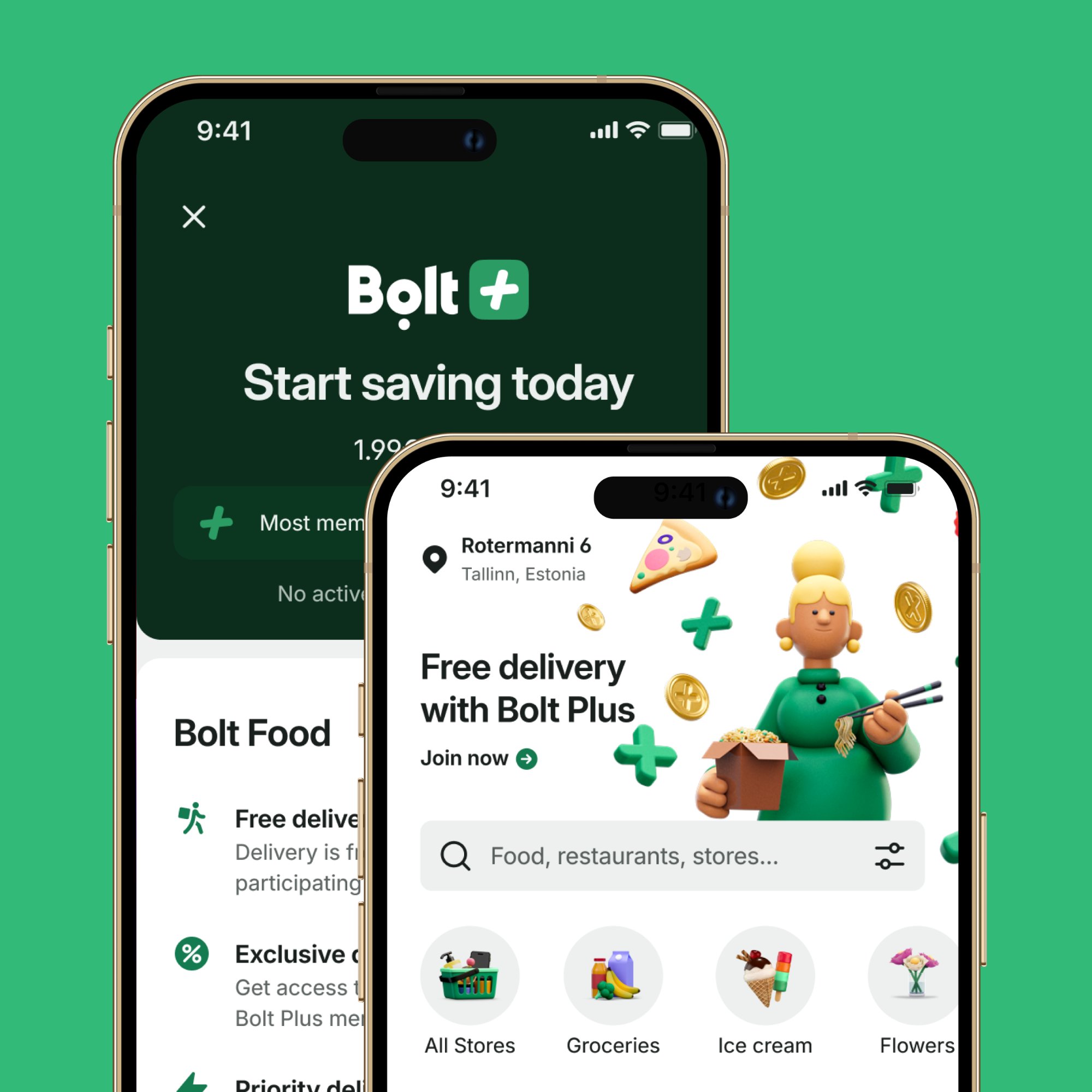
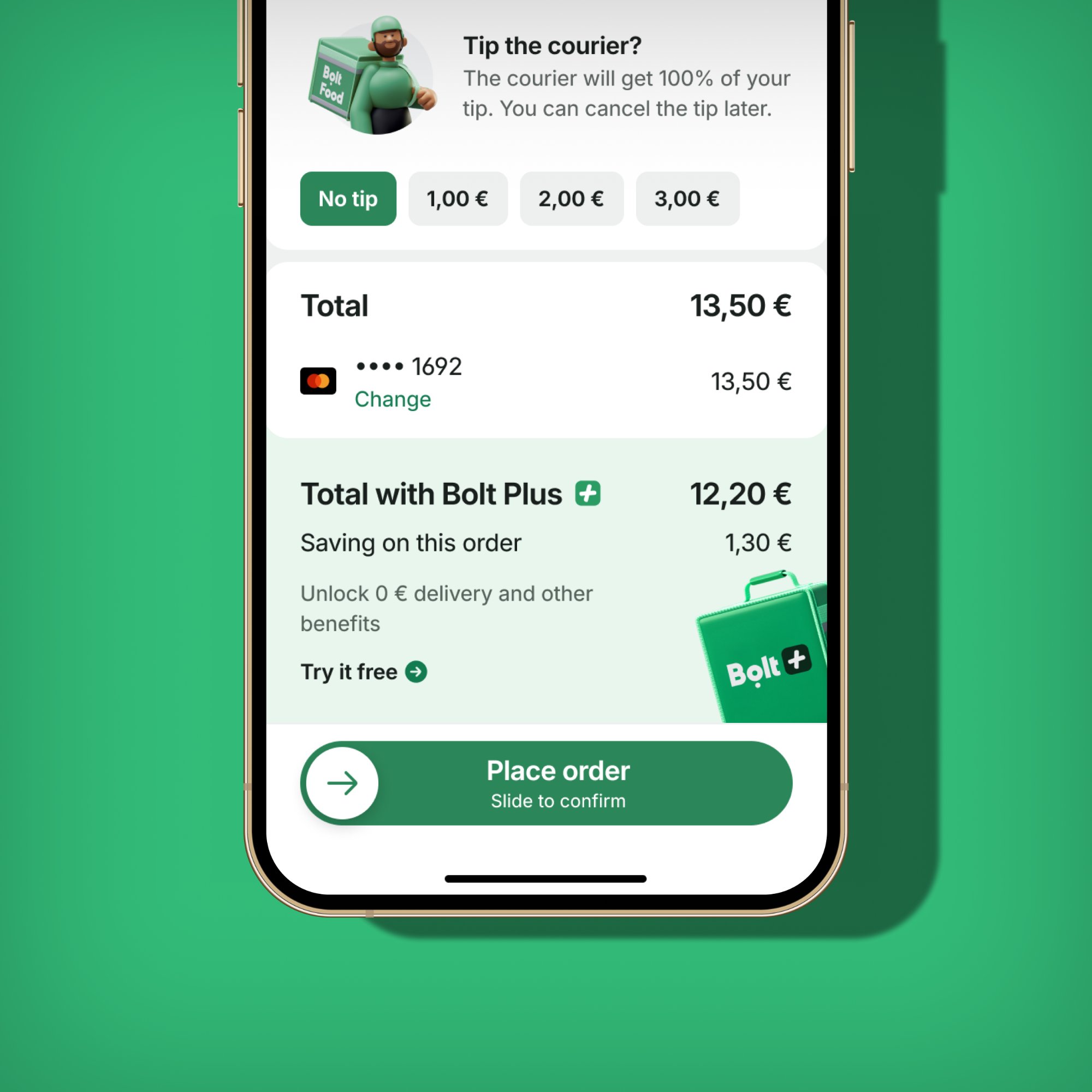
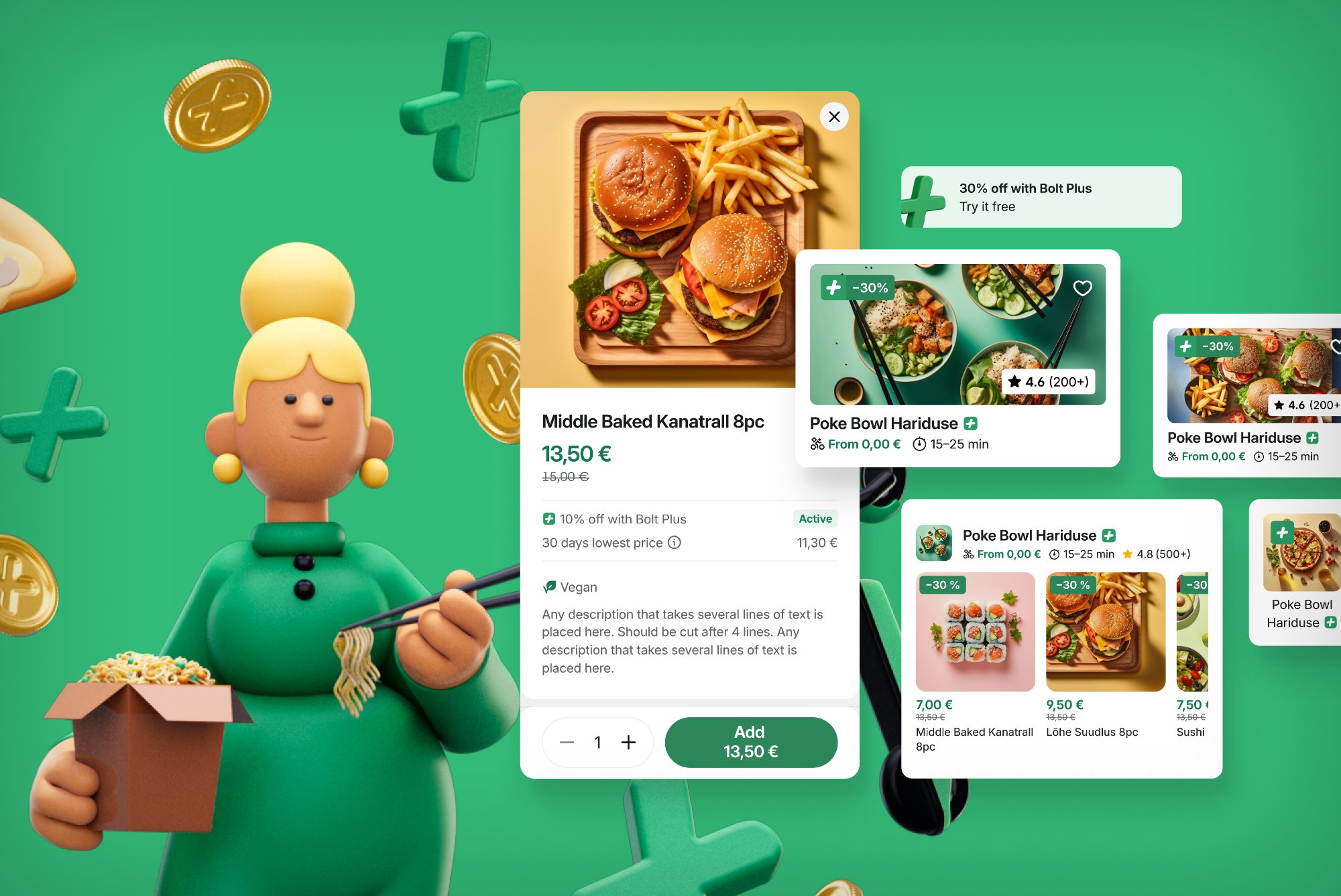
This case study covers three connected features that together form the complete Bolt Plus eater experience: the Hero Banner for acquisition, Menu Discounts for visible in-app savings, and the Checkout Upsell Banner for conversion at the highest-intent moment.

Bolt Plus 3D illustration — cross-vertical value proposition with food, scooter, and cashback coins
Bolt Plus value proposition — cross-vertical savings communicated through the new 3D illustration language.
02   The Problem

Invisible value doesn't convert — and doesn't retain

Before these features launched, the subscription had a communication gap at every stage of the journey:

A subscription is only worth what the member can perceive. If the benefits are invisible at every touchpoint, the value proposition fails — no matter how good the economics.

Feature 01
Hero Banner — Home Screen Acquisition
Position zero · Non-subscribers
03   Hero Banner

Making Bolt Plus the first thing you see

The Hero Banner occupies position zero on the home screen — above all categories, shortcuts, and the banner carousel. For non-subscribed users, it carries the Bolt Plus pitch: full-width, video-capable, and guaranteed visible every single session.

Bolt Plus hero banner on home screen and subscription page side by side
Hero banner (position zero) driving to the Bolt Plus subscription page — new 3D illustration style with animated assets

Why this placement matters

Previously, the Bolt Plus placement rotated in a banner carousel alongside trade event banners and FMCG promotions. One slot among many, auto-rotating every 3 seconds, with impression drop-off beyond the first position.

The Hero Banner gave Plus its own guaranteed, non-competing space. Only one banner per screen, ever — forcing true prioritisation rather than competition for the same slot.

Cohort logic

The banner is shown to non-subscribed users only. Subscribers see the same slot used for seasonal campaigns. This prevents showing a sign-up pitch to people who already subscribe — a basic UX hygiene issue the carousel couldn't enforce.

A/B test

Tested against the existing control (Bolt Plus in the carousel + home category) across multiple markets over approximately five weeks. Primary KPIs: subscription rate, hero banner CTR, and conversion to menu viewed — with overall orders per user as the guardrail metric.

Feature 02
Checkout Upsell Banner
Checkout · Highest-intent moment
04   Checkout Upsell

A personalised saving shown at exactly the right moment

The checkout screen is the single highest-intent moment in the ordering journey. It's also where the cost of not having Bolt Plus is most concrete: this specific basket, this specific order, right now.

Checkout upsell banner showing Total with Bolt Plus €12.20 vs standard €13.50 — saving €1.30 on this order
The checkout upsell banner — computed server-side to show the exact saving on the current basket. "Try it free" CTA with clear before/after pricing comparison.

The design bet

"Subscribe to Bolt Plus" is abstract. "Subscribe and save €1.30 on this order" is a specific, time-bound reason to act right now — on a basket the user has already built.

Variant A

Savings with recalculated total

Shows both the exact Plus saving and the final price as a subscriber. Makes the comparison fully concrete — no arithmetic required from the user.

Variant B

Savings amount only

Shows just the saving figure without recalculating the total. Simpler and faster to scan.

Control

Existing mini-banner

The previous compact format — low visual weight, easy to miss. The baseline for measuring lift.

Technical design

The saving is computed server-side per basket — not a generic claim, but the actual delta between the user's current total and what they'd pay as a Plus member. The banner object (title, subtitle, description, background, image, CTA) is served dynamically, enabling rapid copy and layout iteration without a client release.

Feature 03
Menu Discounts — Visible Savings
Menu · Basket · Order history
05   Menu Discounts

Attributing every saving to the subscription

Menu Discounts are Bolt Plus branded item-level price reductions. Before this feature, campaigns could be running and prices would look identical to all users — the benefit was functionally invisible.

Before
  • Items showed the same price for everyone
  • No visual signal that Plus membership was active
  • Discount applied silently at checkout with no branding
  • No persistent reinforcement across order history
After
  • Green prices on qualifying menu items for Plus members
  • Dedicated Bolt Plus discount line in basket price breakdown
  • Saving visible in active order view during delivery wait
  • Saving preserved in past orders history — attributed to Plus

Why attribution matters

"You saved €3.50" is less powerful than "You saved €3.50 with Bolt Plus" — especially when the goal is retention. Every attributed saving is a micro-reminder of why the subscription is worth keeping.

A new is_bolt_plus flag on the campaign table let every downstream surface — basket, active order, history — correctly identify and display Plus branding without ambiguity. A new DisplayOptionStyle.BOLT_PLUS enum told the UI when to render green prices.

06   The System

Three features that work as one loop

Awareness
Hero Banner

Non-subscribers see the Bolt Plus value proposition as the first thing when they open the app — guaranteed visible, not competing in a carousel.

Consideration
Menu Discounts

While browsing, green prices on qualifying items give non-subscribers a tangible, in-context preview of what Plus would save them on this specific order.

Conversion
Checkout Upsell

At the highest-intent moment — basket ready, about to pay — a personalised banner shows the exact saving on this order, with a direct trial CTA.

Retention
Savings reinforcement

After subscribing, the Plus discount line in basket, active order, and history constantly attributes savings — making value felt with every single order.

07   Reflections

What we learned

What worked

  • Designing the three features as a system — even across different teams — meant they reinforced each other rather than feeling disconnected
  • The single hero banner slot forced stakeholder prioritisation: only the most important message gets position zero
  • Server-side saving computation meant the checkout banner always showed a real number, not a generic claim
  • Attributing savings to Bolt Plus specifically made the brand visible at every value moment

Harder than expected

  • The home category for Plus subscribers had gaps outside campaign weeks — merged into "Bolt Plus Offers" to ensure subscribers always have a discovery entry point
  • The checkout banner's personalisation depended on a new savings computation endpoint — FE was ready before BE, creating launch sequencing friction
  • Multiple teams wanting the single hero banner slot will need clearer governance as use cases scale
More case studies
← Previous DineOut Next → Bolt Brand Refresh
← Back to all work