Designing a brand new dine-in product — from MVP launch through a continuous stream of post-rollout improvements across discovery, payment, and engagement.
A new way to pay at restaurants — built from scratch
DineOut lets restaurant guests discover nearby venues, browse dine-in offers and menus, then pay their bill through the app — earning discounts and cashback in the process. A distinct vertical from food delivery: no ordering, no couriers, just the restaurant experience made smarter.
This case study follows the full arc: MVP launch, UX refinement, geofencing notifications, cross-channel conversion from delivery users, map-based discovery, and trust bootstrapping.
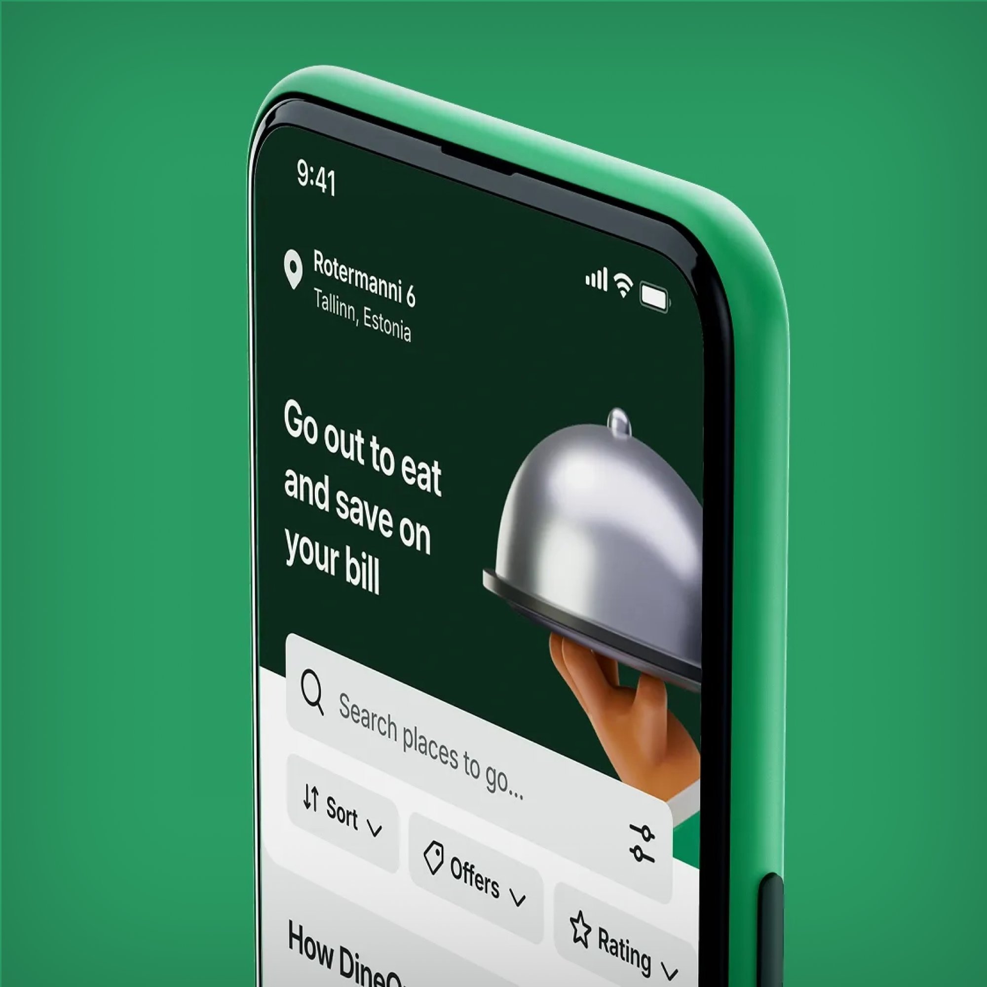
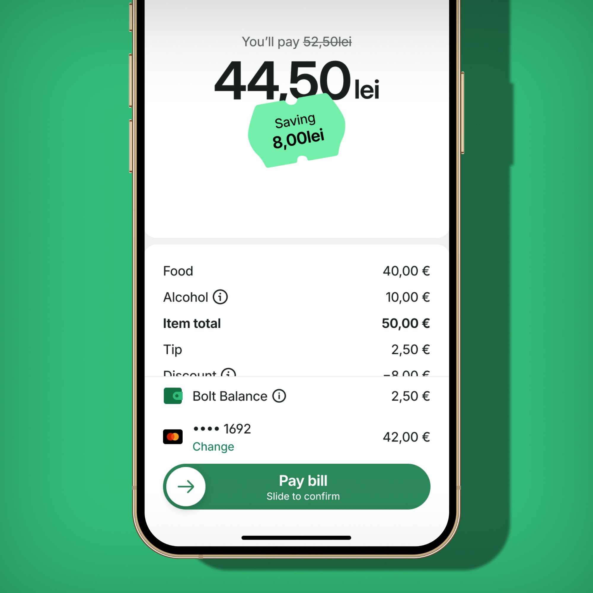
DineOut in action — restaurant discovery, dine-in offers, and in-app bill payment with instant savings confirmation.
02 The Opportunity
Delivery users were already eating at restaurants — we just weren't there
The insight that motivated DineOut was hiding in delivery data: a meaningful share of users who ordered delivery from a restaurant also dined there in person. The app was useful before and after the meal, but completely absent during it.
The challenge wasn't technical. It was behavioural: how do you get someone to open a food delivery app while they're already sitting in a restaurant?
New context, new intent. Dine-in users are physically present, time-sensitive, and in a social situation. Flows needed to be fast and frictionless — not demand too much attention at the table.
Cold start on trust signals. DineOut launched with no ratings, no reviews, no order history. Discovery was harder and conversion lower without the social proof delivery had built up over years.
Two-sided dependency. The product only works if both the eater app and the waiter app (venue-facing) are working in sync — every launch decision affected two codebases simultaneously.
Offer comprehension. The discount/cashback mechanic was new to users. They needed to understand what they'd get, when, and how to trigger it — before committing to pay in-app.
Chapter 01
MVP Launch
Q3 2025 · App v1.96
03 What Launched
The minimum experience that could work end-to-end
The MVP was scoped around one complete loop: user discovers a DineOut restaurant → views the offer → goes to the venue → pays the bill in-app → discount applied. Every other feature was deferred or built to come online after the release cut.
DineOut discovery — the home screen with hero banner, search, and filter options
Pay Bill flow — clear savings confirmation with itemised receipt and slide-to-confirm CTA
Feature 01
Restaurant discovery
Browsable list of DineOut-participating restaurants with offer type, cuisine, distance, and price range. Filter and sort within the dedicated DineOut tab.
Feature 02
Merchant profile & offers
Full profile: menu, photos, opening hours, and a dedicated "DineOut offers" section showing discounts and cashback rates by day and time slot.
Feature 03
Pay Bill flow
Users enter their bill amount and pay through the app. Discount applied automatically at payment, with a clear savings confirmation. Critical path for launch.
Feature 04
Waiter App notifications
When a dine-in payment is initiated, the venue's waiter app receives a push notification — closing the loop between guest and restaurant operations.
Rollout strategy
Staged: project team first on test venues, then employees for internal validation, then public. This caught critical end-to-end issues — especially in the waiter notification handoff — before real users hit them.
Chapter 02
Post-Launch Improvements
Q4 2025 – Q1 2026
04 UX Refinement
"I'm at the restaurant" — redesigning the key moment
Post-launch feedback surfaced a consistent friction point: users understood the app offered discounts, but the moment of initiating payment was confusing. "Pay bill" appeared before they'd signalled presence at the venue, and the offer details weren't surfaced until after they'd already tapped.
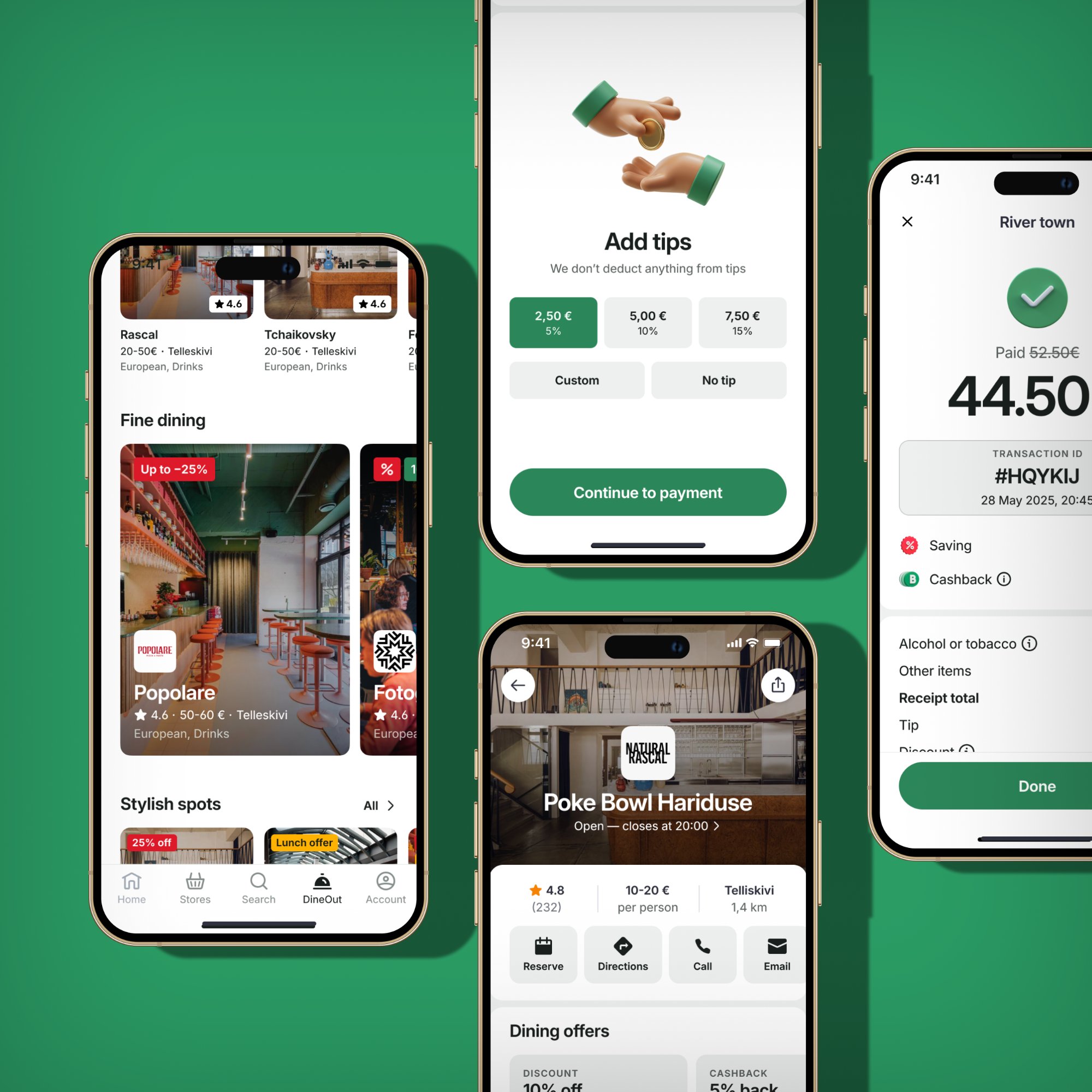
The full DineOut flow post-refinement — discovery to restaurant profile to tipping to payment confirmation, with clear savings at every step.
Before
"Pay bill" as the primary CTA from the restaurant screen
Offer details in a collapsible section — easy to miss
No intermediate step confirming physical presence
No-offer states not handled — led to dead ends
After
"I'm at the restaurant" as the primary CTA — presence first
Active offer shown immediately after tapping — before payment
"How to use your offer" surfaced at the moment of use
Explicit states for "no active offer" and "no offers available"
05 Geofencing Notifications
From planning tool to in-the-moment discovery
The core discovery problem with DineOut was that users only thought about it when already planning a meal. The geofencing feature inverted this: when a user enters a restaurant-dense neighbourhood — like Telliskivi in Tallinn — the app sends a local push notification, even when running in the background.
Trigger
Native OS geofencing
Uses native circular geofencing rather than continuous GPS tracking — the OS handles the trigger at the system level, keeping battery impact minimal even on aggressive Android OEMs.
Anti-spam
30-day frequency cap
One notification per city per 30-day window, managed locally on the device. Works offline, requires no server call at the moment of trigger.
Opt-in
Explanatory screen first
A custom screen explains exactly why "Always Allow" location access is needed before the native OS dialog appears — the highest-risk UX moment for opt-in rate.
06 Map Discovery
A spatial way to find where to eat
The list-based discovery view didn't reflect how people think about where to eat. The map view loaded all DineOut providers for the current city at once — no per-drag loading states, instant marker rendering, a single clean initial load.
Sheet 1
List Explorer (default)
Scrollable provider directory, collapsed to peek height. Always visible as the fallback when nothing is selected on the map.
Sheet 2
Merchant Preview (tap pin)
Tapping a pin shows a focused merchant card — name, rating, price range, distance. One more tap to the full profile. Dismissed by tapping the map.
Sheet 3
Multi-Merchant (overlapping)
When multiple restaurants share coordinates (food courts, busy corners), a horizontal carousel opens for disambiguation without map clustering.
07 Rating Bootstrapping
Solving the cold start with delivery ratings
DineOut launched with very few ratings — most cards showed no star score, which hurts click-through. The fix: many DineOut restaurants already had ratings on the delivery side of the platform. A fallback system now shows delivery ratings when DineOut ratings are absent or below threshold (default: 100 reviews). The source is never shown to users — they see one consistent number.
The threshold is configurable per market, and the initial goal was a measurable lift in home screen → merchant conversion with no visible UX change beyond restaurants now having a star rating.
08 Reflections
What we learned building a new vertical from scratch
What worked
Staged rollout caught critical waiter notification issues before public launch
Decoupling the release cut from backend-only work let the team ship on time
Geofencing's local frequency cap was the right call — server-side caps would have introduced network dependency at the trigger moment
Rating bootstrapping improved UX immediately while DineOut built its own review base organically
"I'm at the restaurant" CTA solved offer comprehension at the single most important moment
Harder than expected
Two-sided waiter app dependency meant venue-side delays had direct user-facing impact
Geofencing opt-in on Android is structurally lower than iOS due to battery optimisation — accepted as a platform constraint
Campaign integration slipped to post-cut — first test users saw the app without active discount content
Delivery → DineOut provider mapping was manual initially; automation should have been in scope for MVP