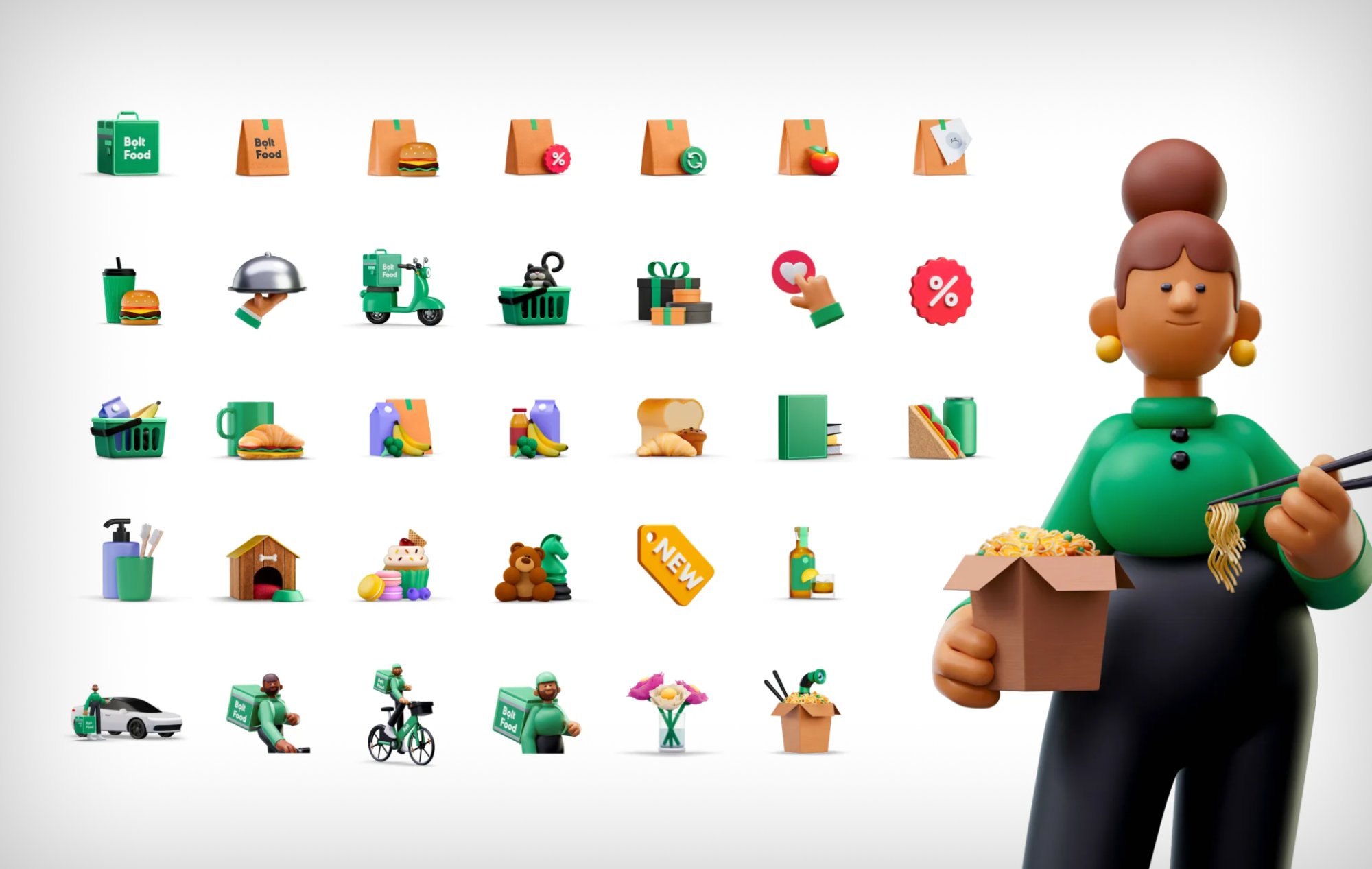
Landing 400+ illustrations and a new visual system across every food screen
The brand system defined the tokens. The work on the Eater side was translating them into the specific, high-frequency contexts of food ordering — splash screen, home, provider menu, checkout, active order, empty states — each with different visual demands and user expectations.
The colour consolidation in practice
- Bolt Food green diverged from Bolt rides app green
- Multiple green variants across interactive elements
- Two reds with no governing rule between them
- Yellow star ratings introducing a third primary hue
- Food app felt "colourful and playful" vs. Bolt's green-only tone
- Hardcoded colour values throughout legacy components
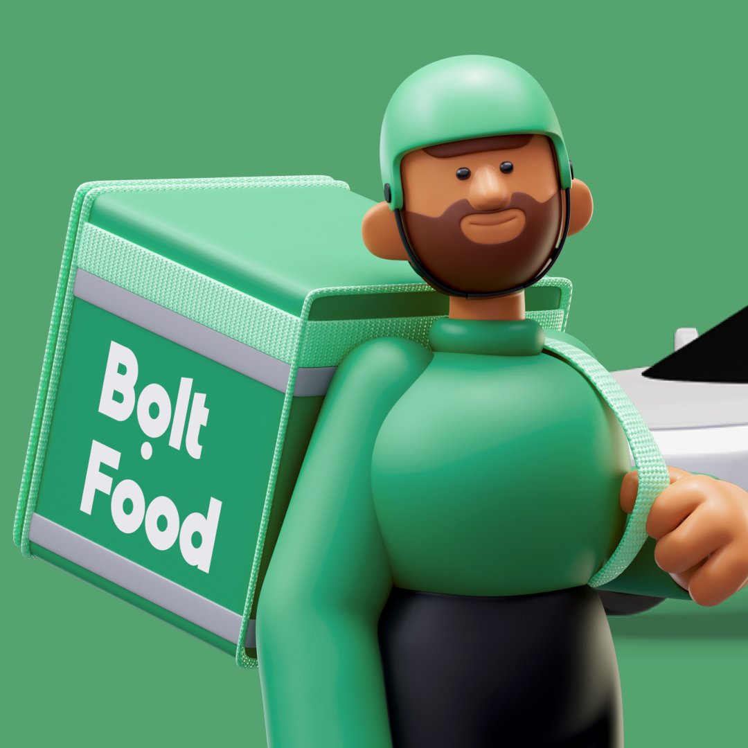
- One brand green — same as vehicle, bag, all apps, billboards
- Darker accessible shade for WCAG contrast compliance
- Single red for all promotional/discount contexts
- Design tokens as single source of truth — dark mode out of the box
- Bolt Food and Bolt rides visually unified for cross-app users
- Legacy components migrated to token system during refresh
Fixing the things that affected every session
Decluttering the image area
Food photography is the primary purchase signal. Rating overlays and stacked badges were suppressing it. Rating moved to the metadata row; image surface reserved for a single commercial tag maximum. Card spacing tightened to recover horizontal room for larger images.
Standardising the system
Too many badge variants for something meant to drive an impulse response. Consolidated to consistent dimensions across all types, and reduced to variants with genuinely distinct meaning.
Fixing WCAG contrast
Non-active bottom navigation elements failed WCAG AA colour contrast. Fixed as part of the refresh — a compliance requirement, not a style decision, that had never been prioritised in isolation.
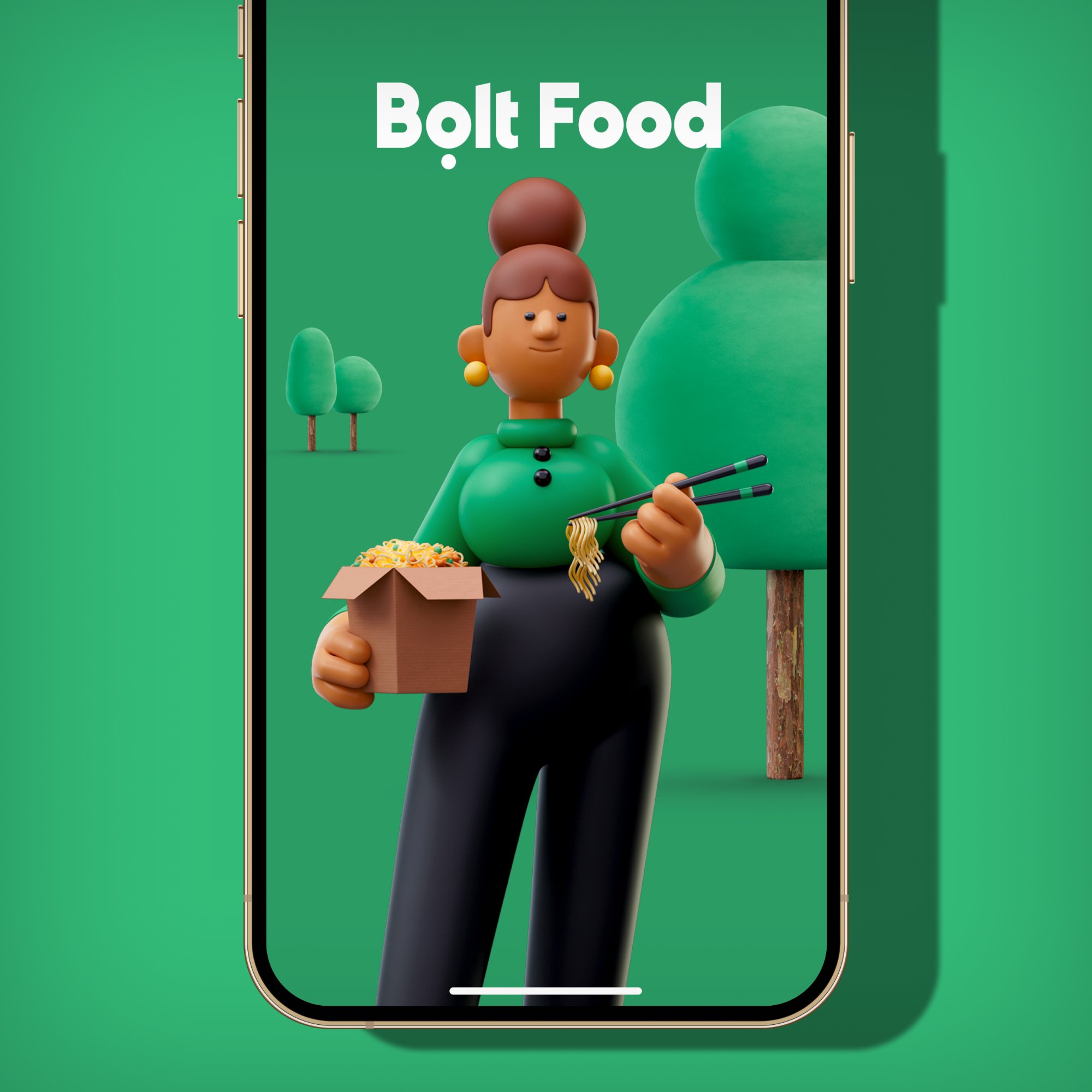
New 3D illustration lead
The first impression of every session, updated with a 3D character illustration in the new brand style. The new Inter logotype replaces Euclid, unifying the splash visually with the rest of the system.
On-brand recovery moments
Empty and error states previously used off-system illustrations or no illustration at all. Each updated with Bolt Food-specific 3D assets — turning moments of failure recovery into moments of brand expression.
No emojis in UI copy
Occasional, inconsistent emoji use in section headers and category labels made the app feel visually noisy. Clear policy established: no emojis in any UI copy, enforced across all surfaces.
Built to last, not just to ship
The refresh ran in parallel with Bolt's broader design system investment — a shared component library and token system across all verticals. The decision was deliberate: a brand update landing on top of hardcoded values creates maintenance debt that compounds immediately. Every future change needs another manual pass.
The design system isn't a constraint on product expression — it's what makes platform-scale brand consistency achievable without an agency every five years.
New colour tokens, updated type scale, 400+ new illustration assets, Qui sound integration. These were the changes users actually see and hear — what lands in the app store update.
Replacing hardcoded colour and spacing values in legacy components with design system tokens. Invisible to users, but it means future brand iterations propagate automatically rather than requiring per-component updates.
The token system created a shared source of truth. A user switching from rides to food delivery now encounters a coherent visual language — same green, same type, same illustration style — rather than the visual discontinuity that had previously been the norm.
What we learned refreshing at scale
What worked
- Building entirely in-house gave the team genuine ownership — decisions were grounded in product reality, not agency interpretation
- Aligning the rebrand with the design system migration means the update stays current rather than accumulating new debt immediately
- The 3D illustration shift had the highest user-perceptible impact for the lowest ongoing maintenance cost — the style scales to new contexts without a different visual language per use case
- The cross-vertical colour unification reduced cognitive gap for users switching between apps — a strategic win that was hard to justify as a standalone project but obvious at platform scale
- The sonic identity (Qui) was the most underestimated element — sound creates emotional resonance at exactly the moments (order confirmation, delivery arrival) that matter most for retention
Harder than expected
- Token migration across legacy components took longer than anticipated — years of accumulated hardcoded values needed one-by-one audit and replacement
- Cross-vertical alignment required negotiating with teams that had made localised design decisions — some changes created friction before creating consistency
- Sound design integration in React Native surfaced unexpected platform-specific differences between iOS and Android
- The competitive benchmark conducted alongside the refresh identified Fit and Tenure gaps — how the app communicates platform breadth, and how it builds reasons to return beyond transactions — that the rebrand surfaced but couldn't fully resolve on its own
The refresh is a foundation, not a finish line
- Mid-scroll brand moments. The refresh established the visual language. The next phase introduces it editorially — Bolt+ value prompts, curated sections, and "Only on Bolt" moments that surface platform breadth to browsing users, not just users who know what they want.
- Motion language. The 3D illustrations unlock animation potential that's been partially realised. A coherent motion system — transitions, micro-interactions, loading states — is the natural next layer on top of the visual refresh.
- Checkout redesign. The visual system is now consistent; the checkout screen's information architecture still needs work. The rebrand fixed the surface; restructuring the Bolt+ upsell, pricing, and payment flow into a coherent section is still ahead.
- System governance. The token system is only as good as the team's adherence to it. Cross-vertical design reviews, shared component ownership, and clear escalation paths for visual debt are the ongoing work that makes a refresh last beyond the launch moment.